Notes on Micro Typography
Collected reflections from Frank E. Blokland on (micro) typography

Capitals and their intrinsic patterning
When capitals are applied to, for example, book covers or title pages they are often simply placed side by side, using the default fitting (spacing) of the font. However, this ruins the intrinsic pattern of the capitals, because the fitting is only suitable in relation to the lowercase. Let’s take a more detailed look at what is happening and how to improve the spacing of capitals.
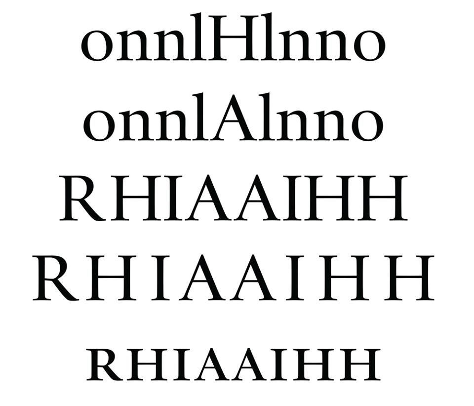
As mentioned, the standard fitting of the capitals is based on the patterning of the lowercase. In the attached image, the capital /H and /A are placed between lowercase letters in the two top rows. The distance from the stem of the /l to the first stem of the /H is proportional to that of the /n–/n and /n–l. The distance is measurably slightly larger, partly to suit the slightly larger weight of the capital /H and partly to make the spacing problem not too large if only capital letters are set. In case of the /A, the spacing cannot be made tighter than the serifs of this capital allow. Consequently, the amount of space within the lowercase x-height is optically and measurably greater than between the /l and /H.
If one typeset only capitals, the spacing will be a mess. After all, the X-height of the capitals is now taken into account and then the /A shows a lot of space on both sides. The distance between the /H and /I is not only very tight in relation to that of the two /A’s, but also in relation to the space within the /H. The lowercase /n, used for the spacing here, has a counter related to that of the /o, but also to that of the /b, c/, /d, etc. After al, to create a pattern, the shapes and sizes of the black and white (counter) parts must be closely related. The same applies to capitals: the space in the /H is related to that of the /O but also to that of the /A, /C, /D, etc. So, if the type designer does his/her job well, the widths of the capitals is related to the ‘fencing’ deflned by the /H. If, for example, the /L does not fit this pattern, the design is by definition wrong.
The problem of the uneven spacing of the capital letters is that it requires editing. If done manually, this is not only a lot of work, but also prone to errors. One solution would be to limit the use of capitals. Another solution could be to use small caps instead. These are by definition less tightly and more evenly distributed, because their size and intrinsic spacing are more related to that of the lowercase. In principle, tracking the small caps with a fixed amount of units will be sufficient.
Some typefaces will have a special OpenType Layout feature for capital spacing: ‘cpsp’. In most cases this does not more than some tracking, which basically dilutes the problem a bit.
––––––––––––––––––––––––––––––––––––––––––––––––––––––––

